SkillBridge
SkillBridge is a web application designed to elevate developer excellence and unleash the full potential of your technical team. Whether you're a startup, established company, or organization seeking to enhance your developers' skills, SkillBridge has you covered.
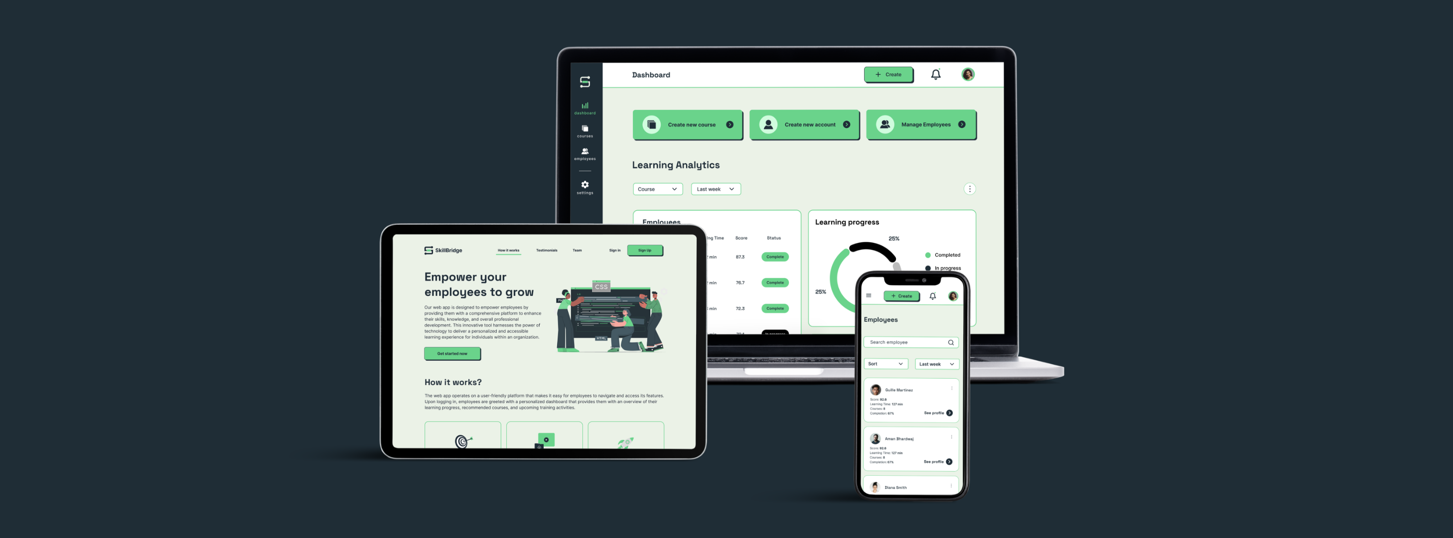
Project Background
During my third semester, I was part of a team of 7, which included 4 Full-Stack Developers and 3 UX/UI Designers. We followed agile project management principles and worked together for 12 weeks. The project concluded with a final presentation in the 13th week, where we presented our work to industry panelists.
My Role and Responsibilities
Role: Project Manager
- Led cross-functional team collaboration to ensure seamless project execution and timely delivery of milestones.
- Organized sprint planning sessions to define clear objectives and allocate resources effectively.
- Used JIRA to meticulously track and manage issues and tickets, ensuring transparency and accountability across the team.
- Proactively identified and addressed blockers, fostering a culture of problem-solving and continuous improvement.
- Maintained regular communication with team members to monitor progress, provide support, and facilitate resolution of any challenges.
- Implemented agile methodologies to streamline workflows and optimize productivity, resulting in increased efficiency and on-time delivery of projects.
Role: UX/UI Designer
- Equal part in developing the design for the product from user research to final design.
- Conducted user interviews and defined the personas
- Worked on mapping feature sets and user flows
- Developed wireframes and high-fidelity mockups
- Collaborated on the logo design and helped design the overall branding and UI components
- Worked on composing the business proposal document
Why SkillBridge?
We created SkillBridge, a B2B web platform, to help new developers transition into the tech industry. As students in web development, we saw the need for practical training in dynamic work environments. The idea for SkillBridge is to offer tailored learning modules within companies, empowering newbies to quickly adapt and contribute effectively.
Design Process
UX Process
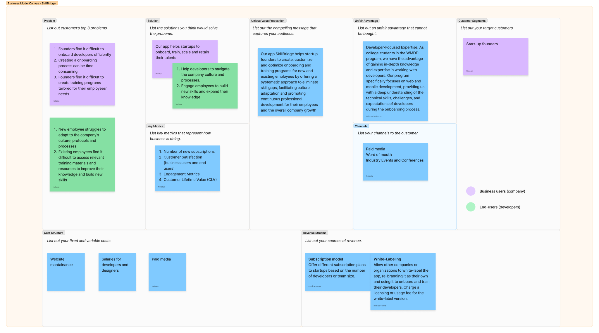
Creating the Lean Canvas for SkillBridge involved distilling our business idea into key components like customer segments, problem statements, value propositions, and revenue streams. We iteratively refined each section through brainstorming and research, using the canvas to guide decision-making, prioritize features, and stay aligned with our vision.
User Interviews
We focused on interviewing fresh/newly hired developers with following set of question to understand their pain-points and end goals
User Personas
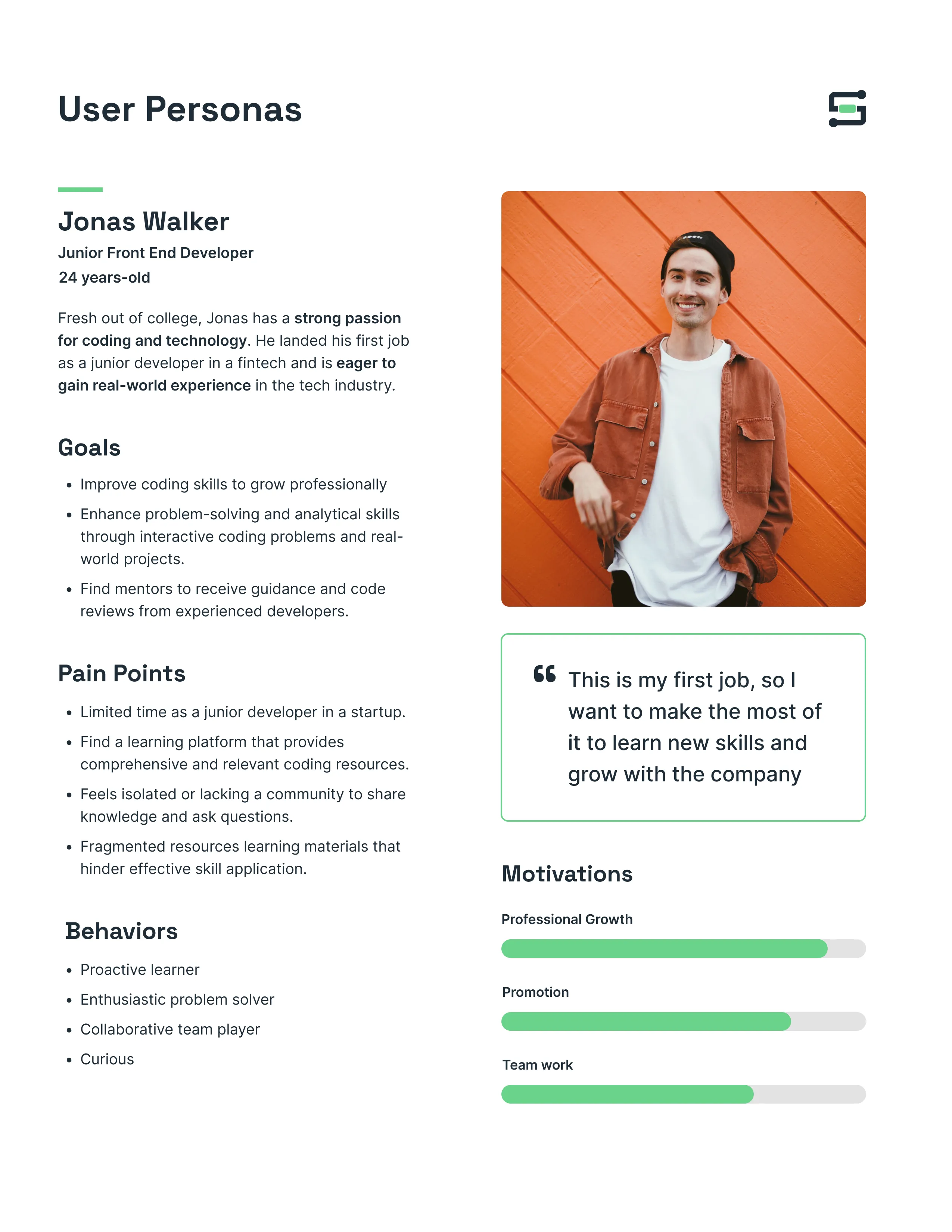
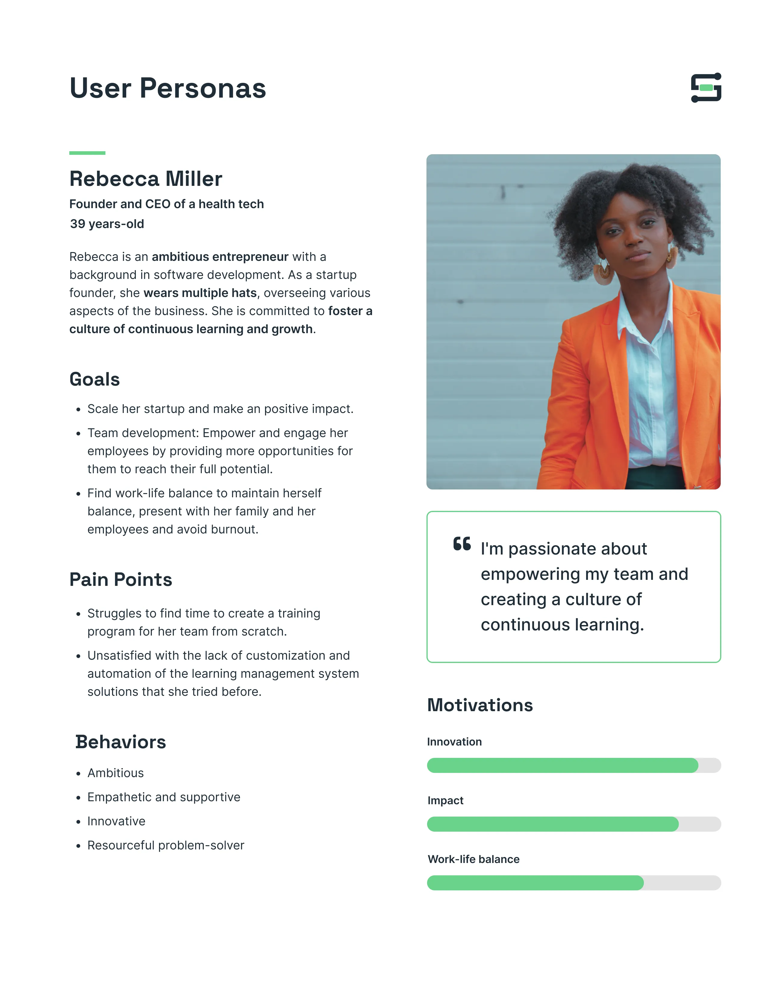
The above research and interviewing helped us define our two user personas. We also tried to layout user's first point of contact with our app and more importantly define how the apps' features will benefit the user.
Developer Persona
Business Owner Persona
Site Mapping & User Flows
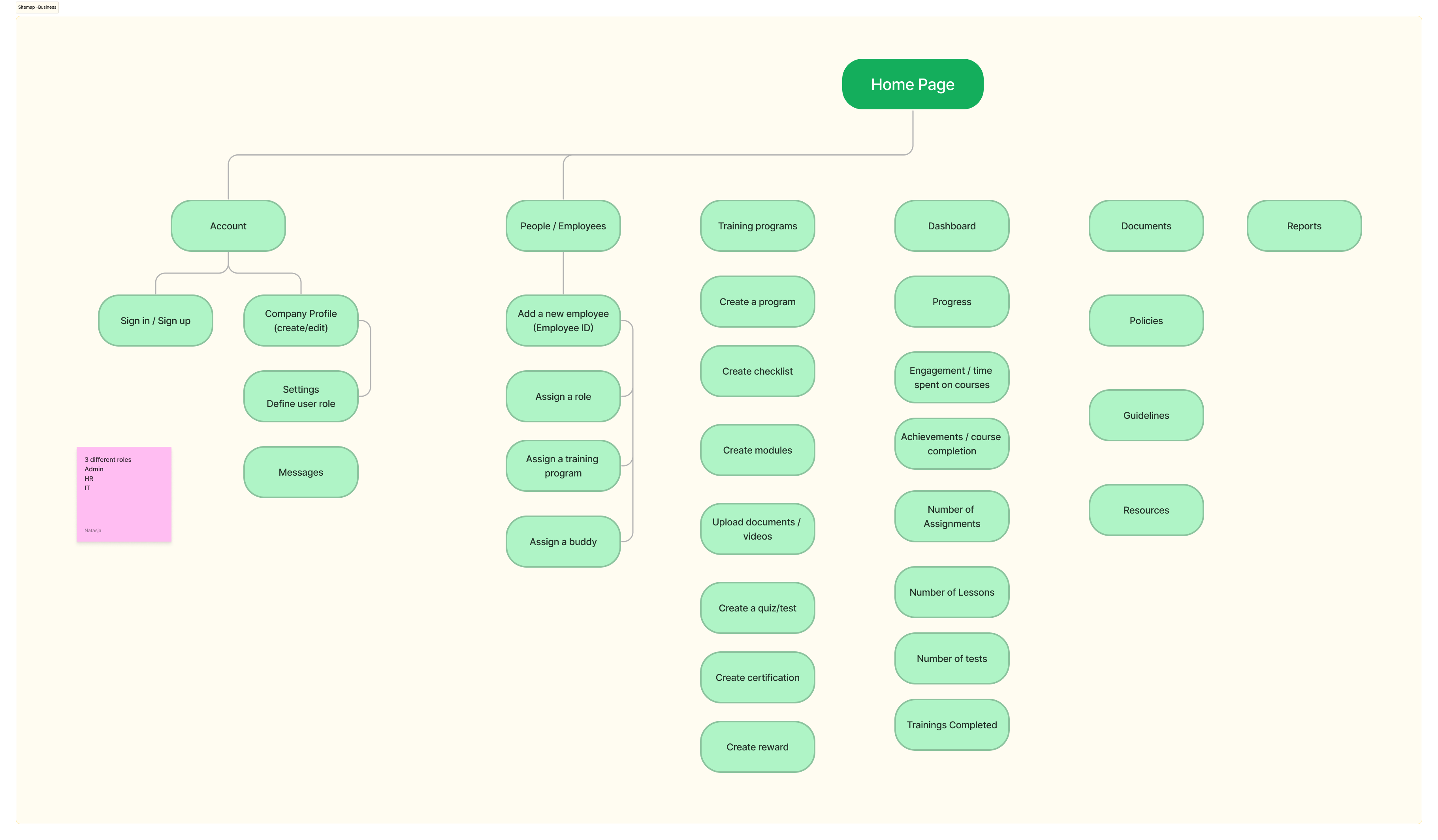
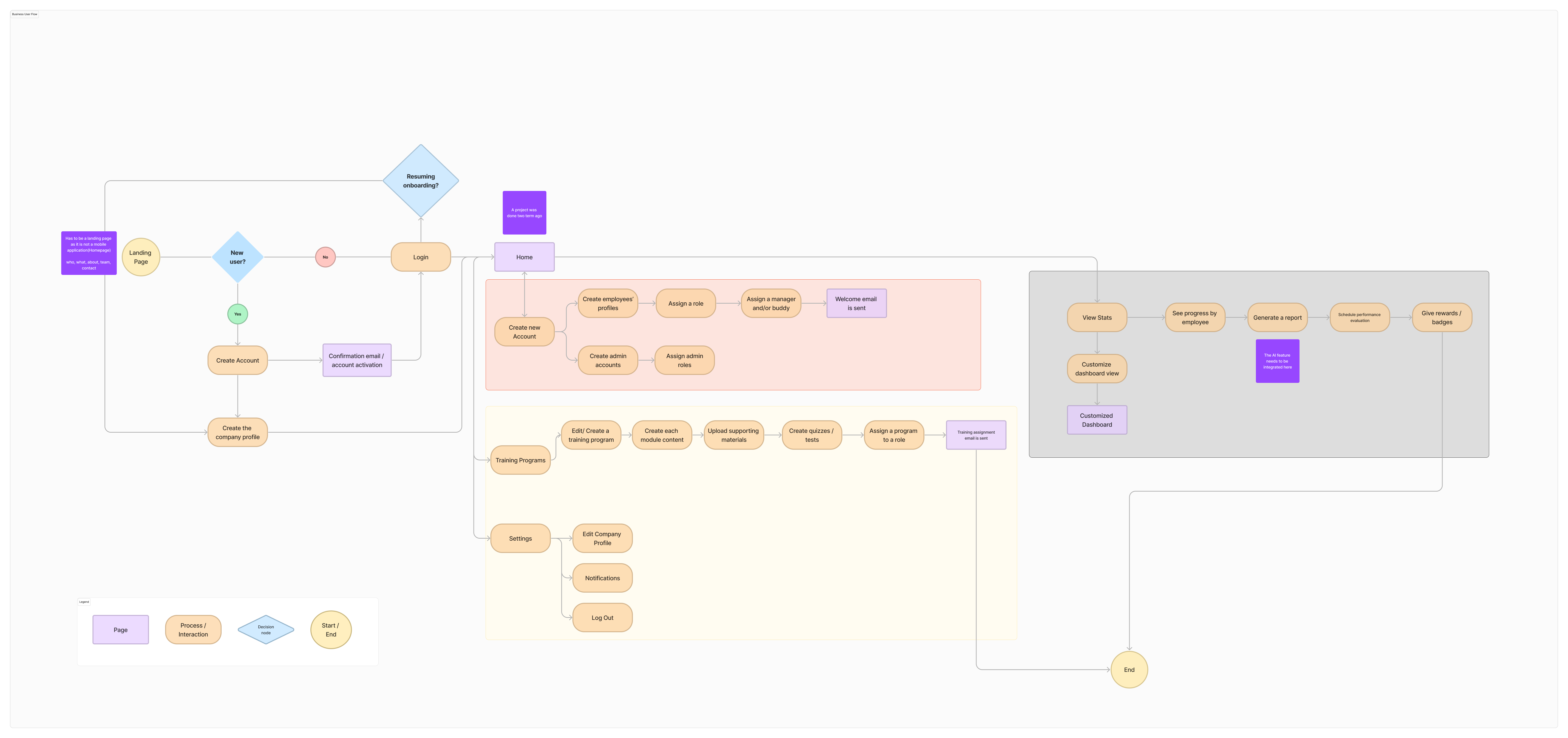
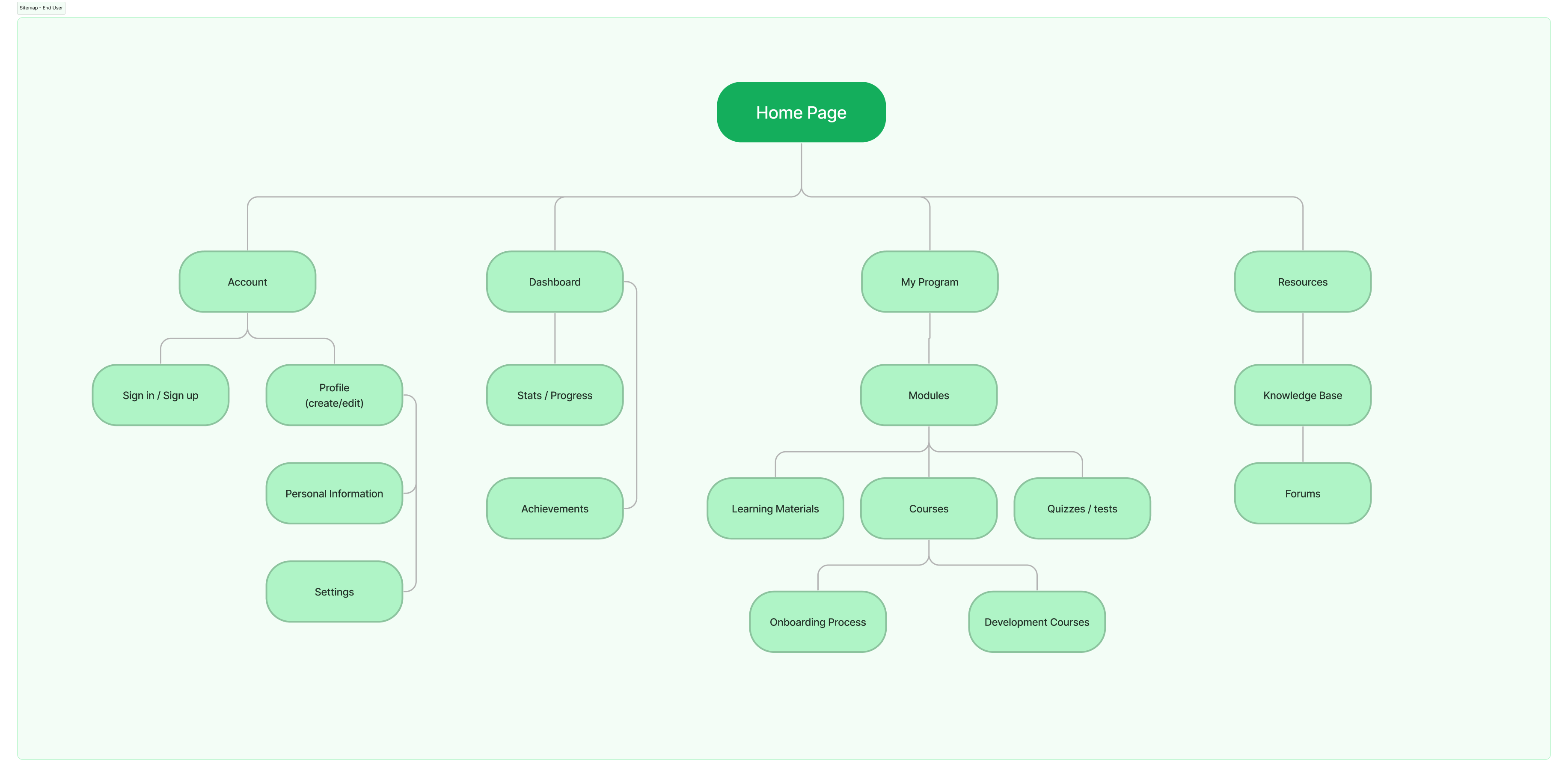
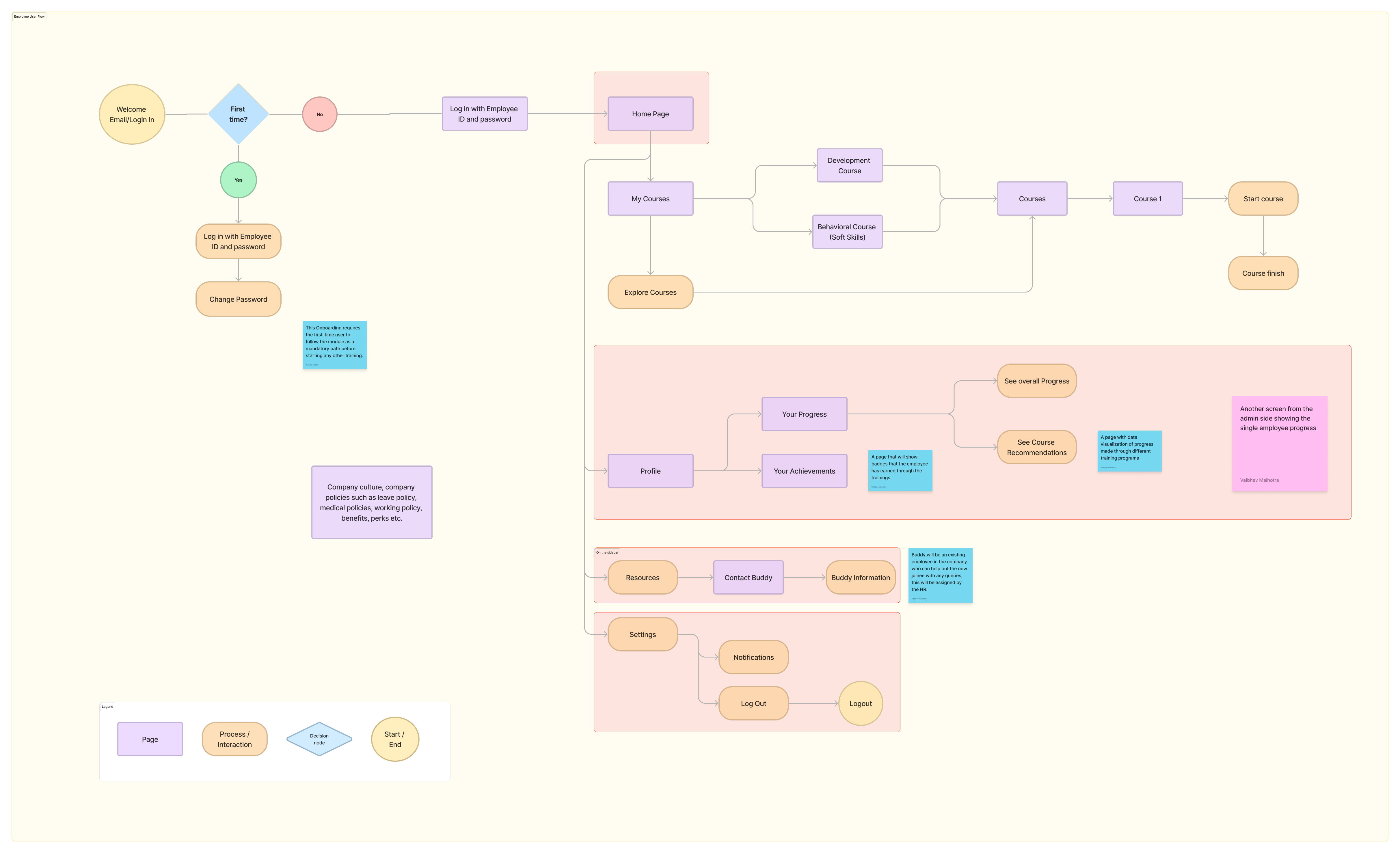
After finalizing features and gaining in-depth understanding about our users, we start to work on the site map to futher develop detailed user flows for both user bases.
Business Site Map and User Flow (collaborated and developed on FigJam)
End User - Map and User Flow
Wireframing
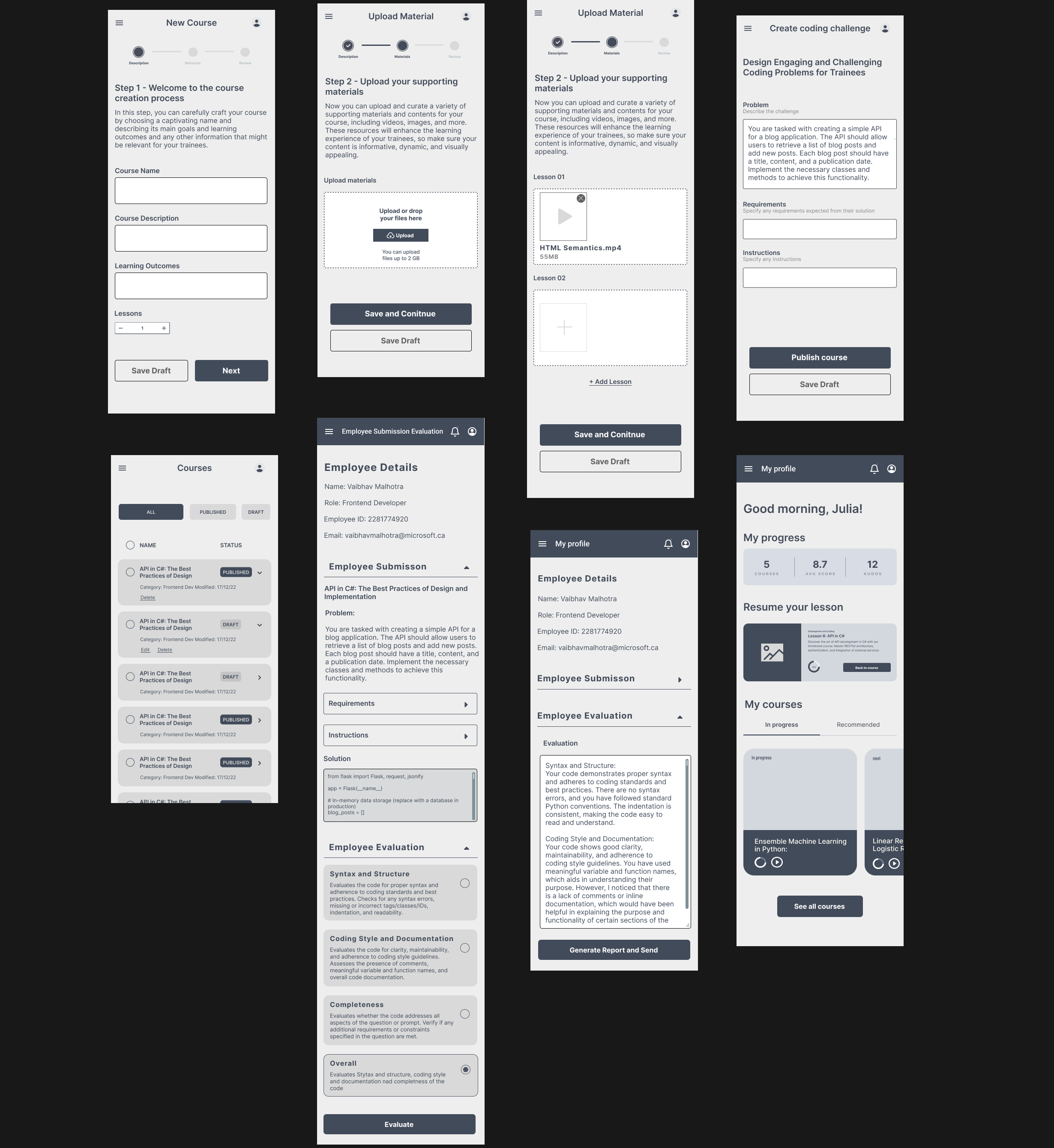
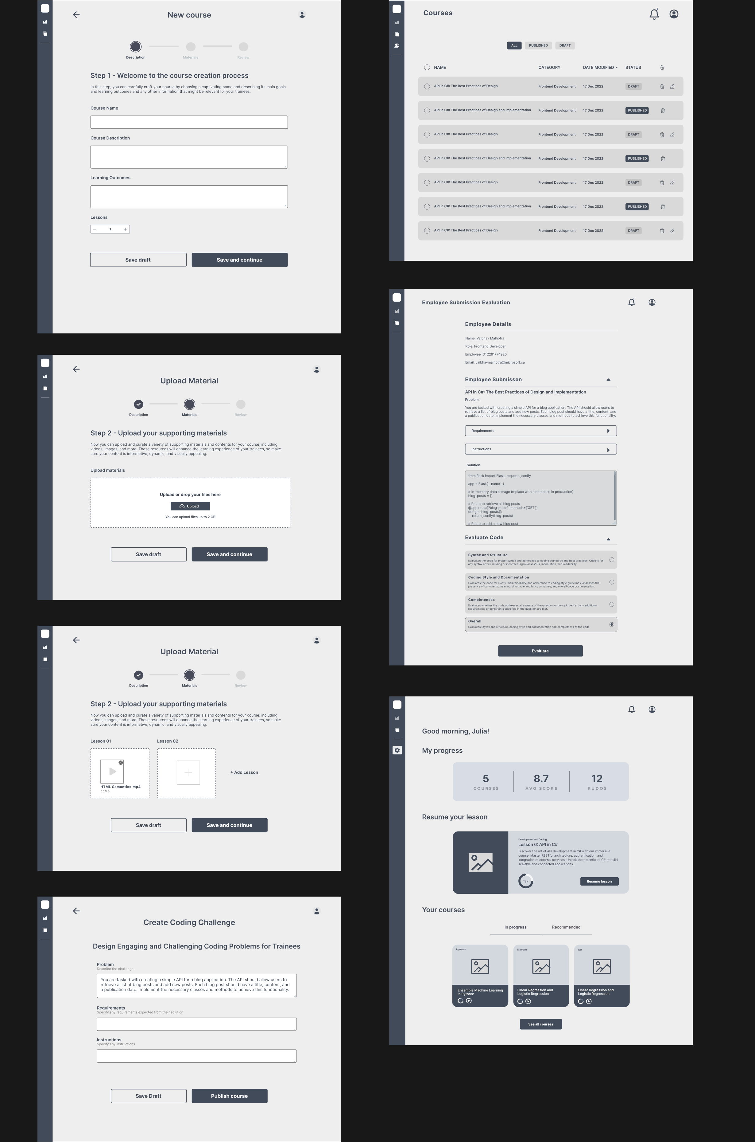
After acccumulating all the user data and finalising of features and user flow, we started working on wireframing the MVP flow for both our users.
Below are some sample screens of the high-fidelity wireframes (Mobile and Desktop)-
UI and Branding Process
Logo Design
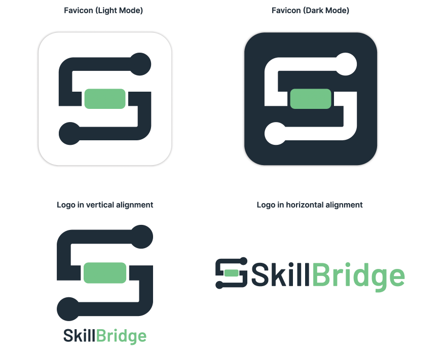
We worked on the logo design with a concept to symbolize the 'bridge' rather connection between the employee and their company.
The letter 'S' represents the path between the two, while the green element in the center symbolizes the 'bridge'.
Color Pallete and Typography
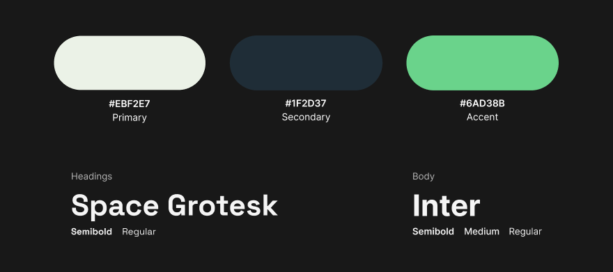
This palette combines the calming and fresh qualities of Primary Color, the reliable and sleek feel of Secondary Color, and the vibrant energy of Accent Color. Together, these colors create a visually pleasing and cohesive scheme that aligns with the tech industry, evoking growth, trust, sophistication, and excitement for the web app users.
We chose Inter as our body paragraph font for its readability, adaptability, and accessibility, ensuring a smooth user experience with clear and legible content. As for the heading font, we opted for Space Grostek to add a touch of modernity and distinctiveness, creating a visual hierarchy and drawing attention to important information within the app.
UI Components
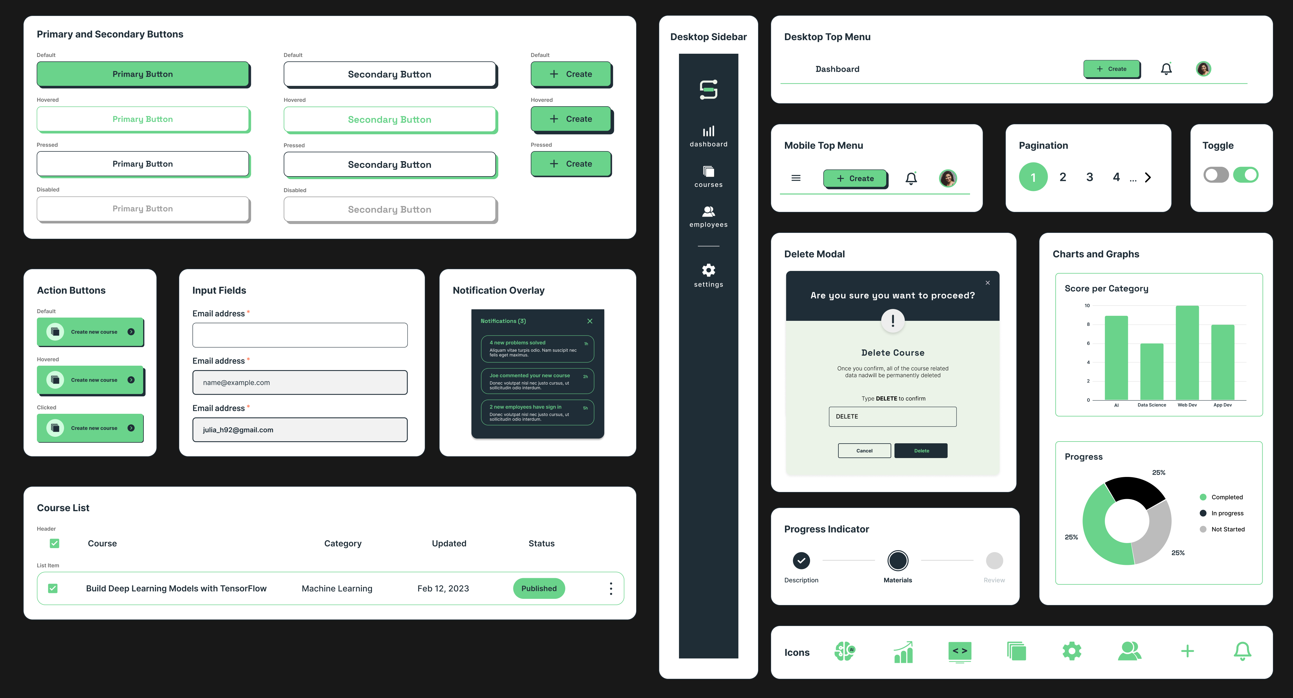
Design System
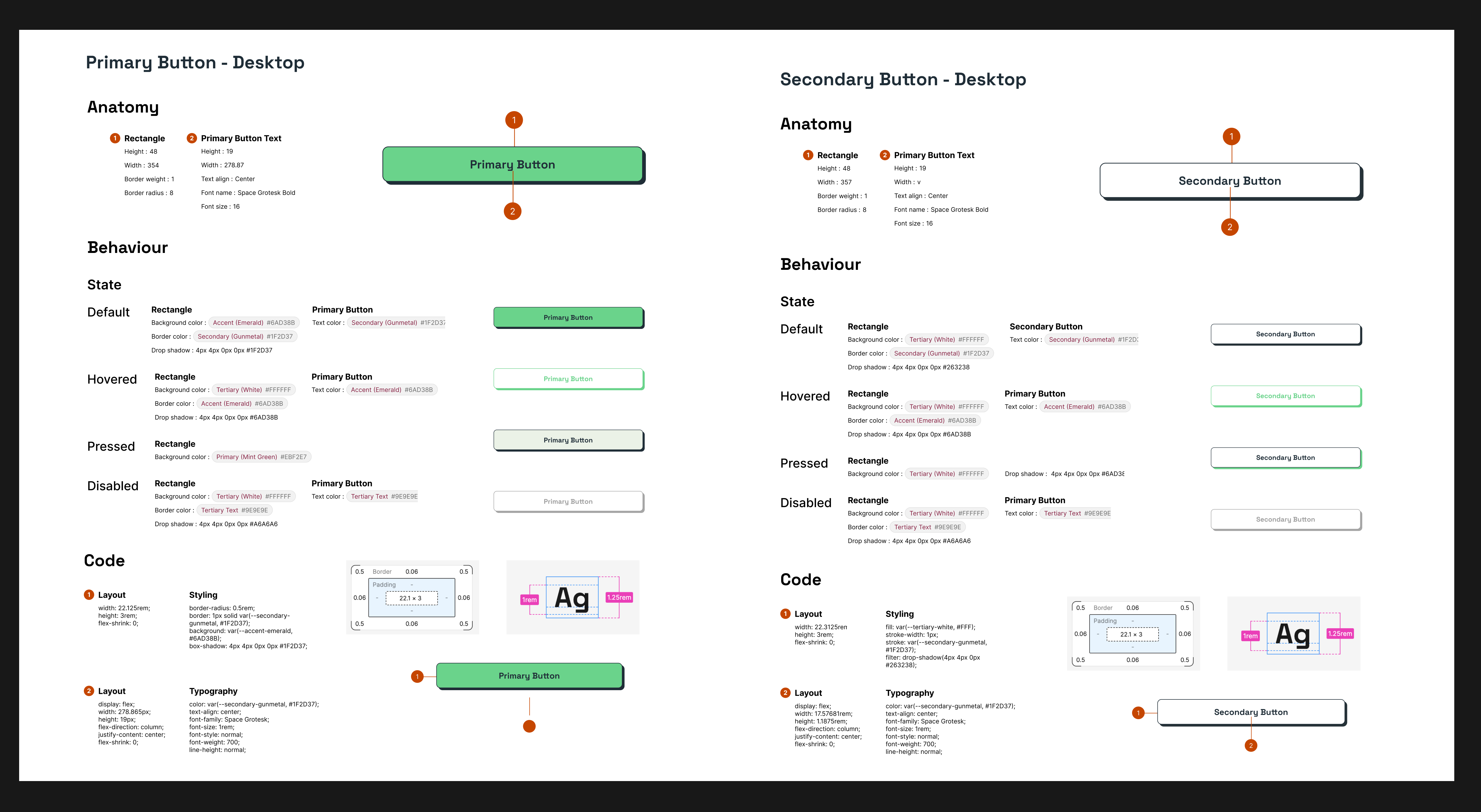
Data Visualization
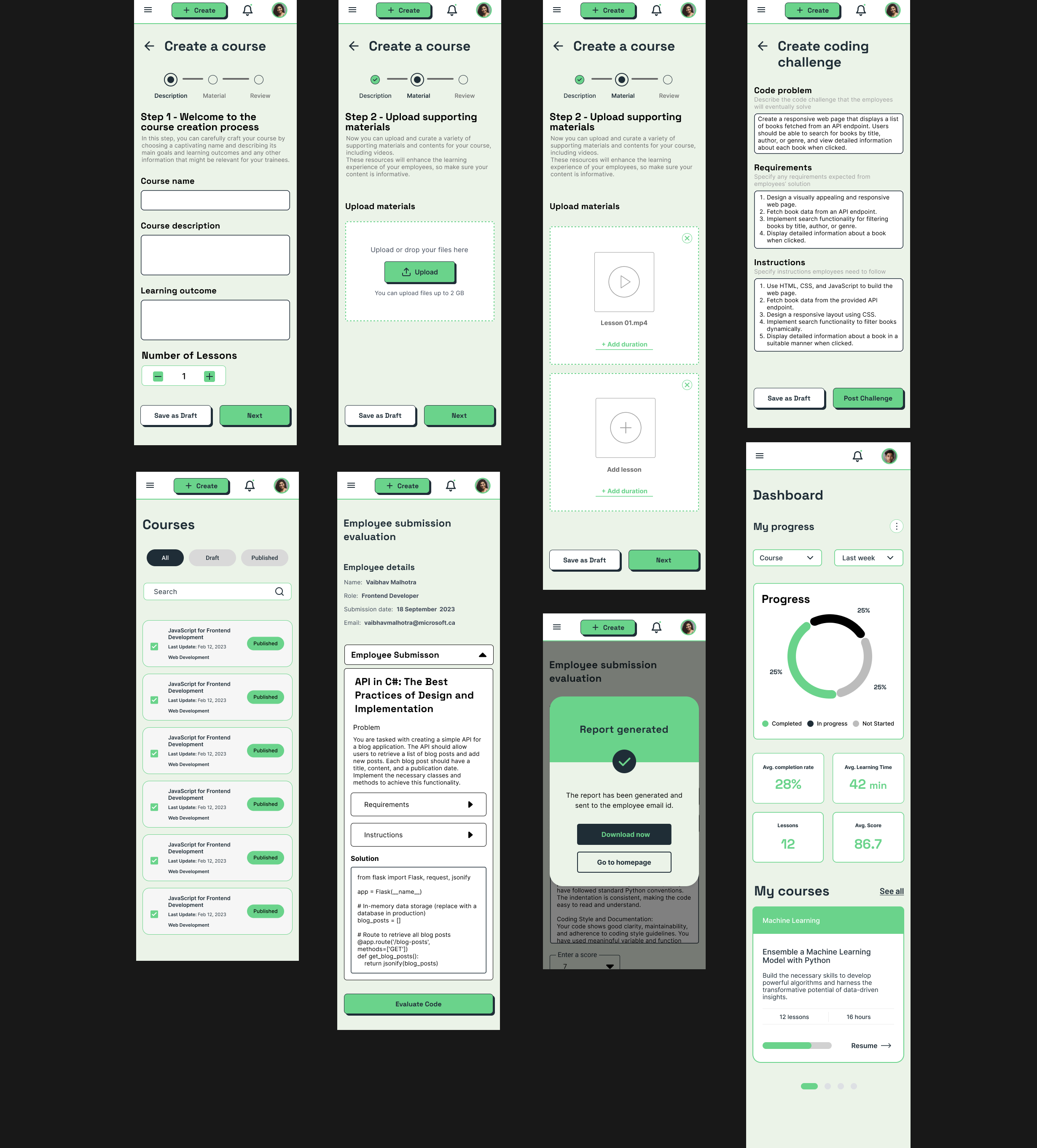
Our main goal was to keep the data visualization simple, consistent, intuitive and to give the user control to interact with it to complete their tasks on the platform.
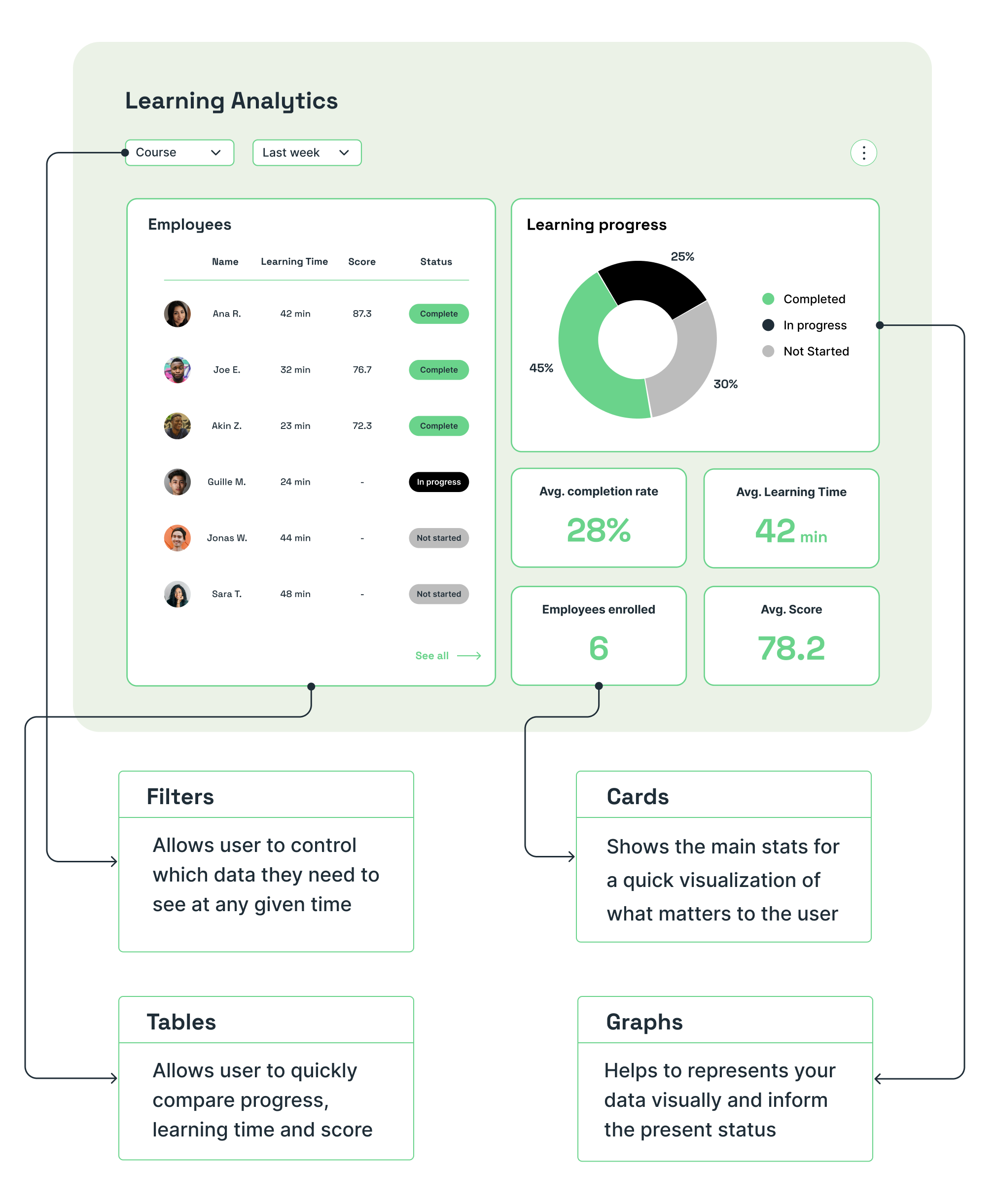
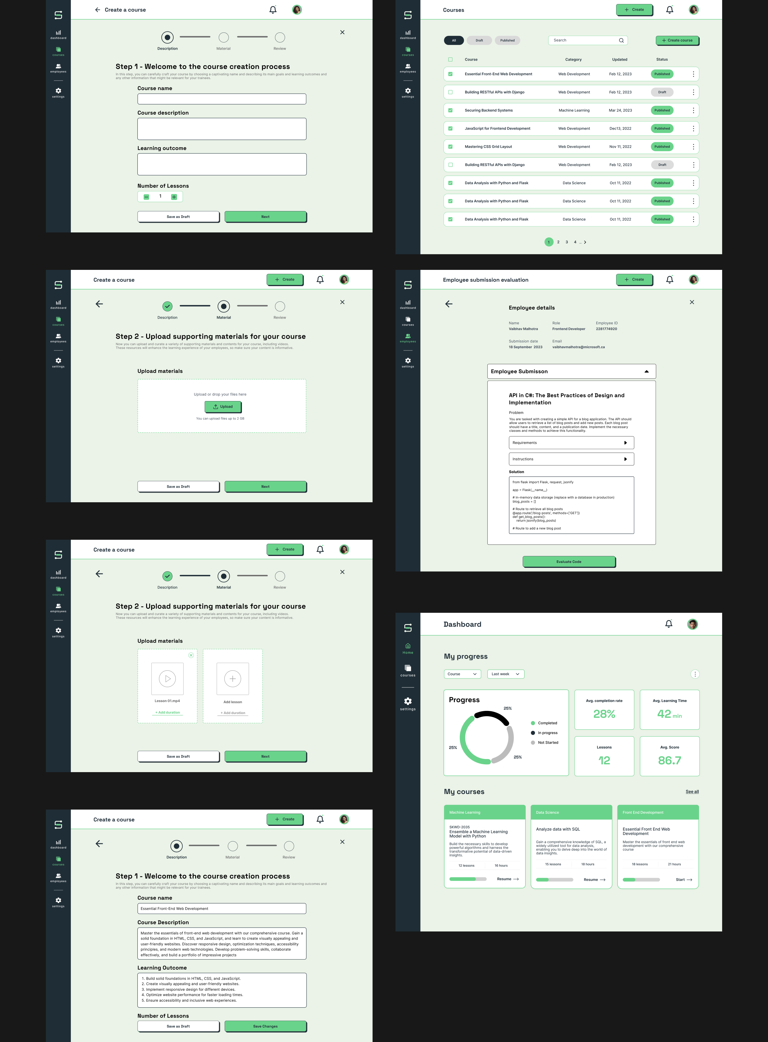
Mockups
User Testing
During the final stages of the development, we conducted an internal user testing by giving them a user scenario and asking them to complete a task
Scenario
You are a senior developer at a startup.
You are currently on the landing page of SkillBridge.
Your junior developer (employee) Guille Martinez has recently submitted a code solution.
You have to Sign-in and evaluate his submission and provide a score.
You can generate a report after evaluating.
User testing feedback
Overall 3/6 users were able to complete the scenario but required little more time to navigate through the dashboard.
Next steps after User Testing
My TAKEAWAYS from the project